Design Principles // Exercises
16/04/20 - 23/05/20 / Week 1 - Week 5

We looked at different artworks with each principle being the main focus, analysed and talked about the other principles in action. We talked about and we'd have different ideas and interpretations none which could be considered wrong, as they're our own way of seeing the artwork.

The swan/ballerina is based upon the movie "Black Swan". I saw movies that have deep emotional scripts or a typically fear driven have inspired many artists to do beautiful artworks and contrast is a very big factor in them. I used a reference photo of a ballerina and a swan and used photoshop to draw it by myself.
This following drawing is very simplistic and I got the idea based on the action of opening door knobs. I thought it would be interesting to replace it with a silhouette of a persons head instead. I used no reference for this other than my hands in real life which I looked at while sketching this.
Lastly, this design is also based upon a movie. "The Birds" was a horror film from the 1960s and had a lot of interesting minimalist posters and I had the idea of using someones eye to act as the birds eye as well. In this one you can see persons eye is also a crows head and I used feathers to mimic the features of a human face such as the eyebrows and nose. The body of the crow also serves to give more shape to the persons face.
After some discussion with Ms Anis, she said she liked both the birds. The crow had better gestalt theory in place while the swan had a more appealing contrast/design. I was told to continue with the swan design but just to make the face less obvious. I sent the picture to Ms Anis and she responded with an edited version of it, she made the face more subtle, added a crown to the swan and utilised the composition better. After which I polished the design off and finished it.


Figure 1.07: Crow design with reversed colours
I chose the white background design as Ms Anis said the contrast it better in it. For the real life work it was a little hard since quarantine doesn't allow us to leave and I couldn't buy any glue, I used tape instead. I also struggled cutting the paper because the black paper I owned was so opaque I couldn't use a window to trace my design. I ended up sticking the printed design over the black paper and cutting out what I needed, after which I stuck the black paper on the white paper using tape.


REFLECTION:
I thought that this was a interesting artwork and concept to work with, being limited can often lead to more creativity because you really need to force out an idea when your options are limited. I do wish that MCO was over because I struggled with this over unnecessary things, like not being to leave and buy glue. I improvised and used tape instead until I can get glue. I noticed that a lot of horror movie movie posters often use the gestalt theory and I found that to be a really interesting observation. Overall I really liked this task it was interesting and I liked my outcomes.

Next up was a design for balance, I wanted to use a similar colour scheme to the piece on emphasis. In this piece there diagonal symmetry as well as a balanced a symmetry between the hands. It can be viewed from upside down and the balance would not be changed. I would use pencils for my hands and frame and markers for the background.


Ibrahim Fazal Ahmad / 0337423
Design Principles / Bachelor of Design (Hons) in Creative Media / Taylors University / Exercises
WEEK 1
LECTURE 1 // 16/04/20
Today we met our lecturer Ms Anis, we learned about different principles and elements in design and how they all contribute to the aesthetics and overall outcome of the work. There were eight elements: dot, line, shape, form, colour, value, texture and space.
Figure 1: Elements of design
We then learned about the 12 principles, I've done research on these before and there are varying amounts of principles but we learned about 12 of them being: balance, emphasis, repetition, movement, harmony, unity, contrast, figure-ground, similarity, proximity, continuity and closure.
We looked at different artworks with each principle being the main focus, analysed and talked about the other principles in action. We talked about and we'd have different ideas and interpretations none which could be considered wrong, as they're our own way of seeing the artwork.
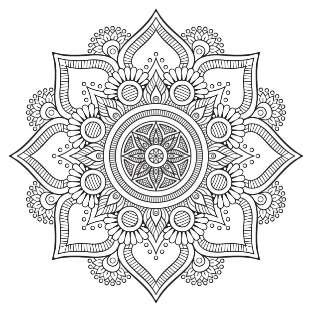
Figure 1.01
For instance, this artwork displays contrast as its main design principle. The orange and black creating an instance contrast. However you can also see the gestalt principle in action, on first glance you can see the person in the centre which a bright orange background. The orange background is what looks to be a crow and it's as though the person is trapped inside.
/Getty_Emphasis-167532036-56afa5cc3df78cf772c714d1.jpg)


WEEK 2
LECTURE 2 // 23/04/20
Today we learned about the principles; Balance & Emphasis. Emphasis is used to create dominance and attract your attention to the subject. Whether it's using colour, shadows or lines. Such as:
Figure 2: Example of Emphasis
This picture shows emphasis as simply as can be, all the umbrellas are black except one. The red one attracts your attention immediately due to the contrast. Next we learned about balance. It can be symmetrical or asymmetrical. There are different types of balance as well, radial and bilateral balance.
Figure 2.1: Radial balance.
There is radial balance as you can cut it like a pie chart and there will be symmetry. There is also the more common type of symmetry being bilateral.
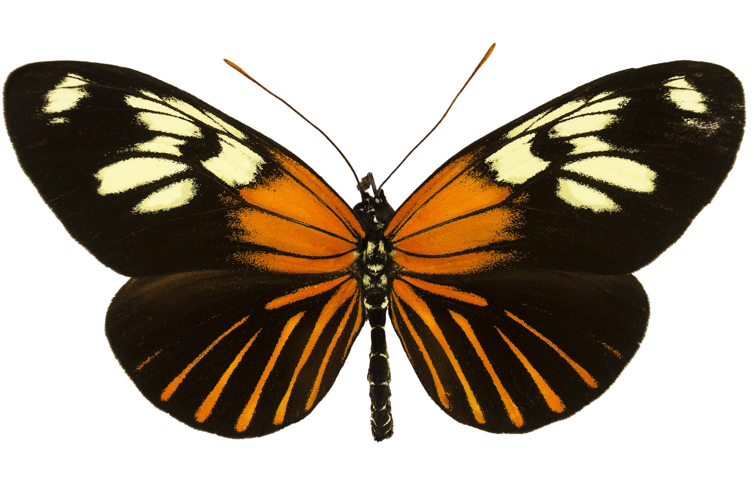
Figure 2.2: Bilateral symmetry.
This is a simple example of bilateral symmetry, you can draw a line down the centre of the butterfly and there will be symmetry on its wings. Bilateral symmetry can be both vertical and horizontal, this one is more so vertical than horizontal as both sides a near identical vertically.
WEEK 3
LECTURE 23 // 30/04/20
Today's lecture was about Repetition, Movement, Hierarchy and Alignment.
- Repetition: Repeating patterns, could make a work seem active and give movement. Create rhythm and patterns
- Movement: Designs leading the eyes around through a composition. Can give the illusion of "movement" in a artwork
- Hierarchy: Directing viewers to the most important aspect of the work and navigates them through the given content
- Alignment: Places of elements in a way that edges line up along common rows to create a sense of unity and cohesiveness.
WEEK 4
LECTURE 4 // 07/05/20
This weeks class was not held as it was a public holiday, so we had to watch the pre-recorded lecture by Dr Jinchi instead. From what I understood, harmony and unity are basically in every piece of art. There is always a sense of harmony meaning the visual elements look like they're all apart of a singular piece. Harmony is like a belonging of a group of objects, whether it's using shapes, colour or texture. Unity also has a similar meaning, when the elements of the piece all agree and look like they are supposed to be together.
WEEK 5
LECTURE 4 // 14/05/20
Lecture: The lecture today was about symbols and typography. Symbols are used in everyday life, and there are different types of them. But firstly, a symbol is sign, shape or object that is used to represent something else. It usually conveys information quickly and without the need for words. So there a three different types of symbols:
- Pictorial - Images and simple pictures.
- Abstract - Not detailed but represent the item they are meant to be
- Arbitrary - No resemblance to its meaning, geometric and colour based. It's something we learn rather than understand immediately.
Figure 5: Pictorial Symbols
Figure 5.01: Abstract Symbol
Figure 5.02: Arbitrary Symbol
Typography is what we will be doing, but what we learned exactly was "imagery" and its importance in design. It allows the viewer to be able to relate to the design in question whether it is from a brand or personal concept. Using appropriate images are important for design.
Figure 5.03: Typography
TASK:
WEEK 1: CONTRAST AND GESTALT
Do an artwork using only black and white paper to show off the following principles: contrast and gestalt theory.
To start off I began with research and used a lot of pinterest to look for inspiration and examples to use as reference. I ended up finding a lot of horror movies have gestalt theory in action on their posters, a new observation. I did 3 digital sketches:
 |
| Figure 1.02 |
The swan/ballerina is based upon the movie "Black Swan". I saw movies that have deep emotional scripts or a typically fear driven have inspired many artists to do beautiful artworks and contrast is a very big factor in them. I used a reference photo of a ballerina and a swan and used photoshop to draw it by myself.
 |
| Figure 1.03 |
This following drawing is very simplistic and I got the idea based on the action of opening door knobs. I thought it would be interesting to replace it with a silhouette of a persons head instead. I used no reference for this other than my hands in real life which I looked at while sketching this.
 |
| Figure 1.04 |
After some discussion with Ms Anis, she said she liked both the birds. The crow had better gestalt theory in place while the swan had a more appealing contrast/design. I was told to continue with the swan design but just to make the face less obvious. I sent the picture to Ms Anis and she responded with an edited version of it, she made the face more subtle, added a crown to the swan and utilised the composition better. After which I polished the design off and finished it.


Figure 1.05: Black swan sketches

Figure 1.06: Final Sketch
Then we realised that there were actually two pieces to be done and since I already finished this one I redesigned the crow/face design into something a bit more appealing in terms of design and composition:


Figure 1.07: Crow design with reversed colours
I chose the white background design as Ms Anis said the contrast it better in it. For the real life work it was a little hard since quarantine doesn't allow us to leave and I couldn't buy any glue, I used tape instead. I also struggled cutting the paper because the black paper I owned was so opaque I couldn't use a window to trace my design. I ended up sticking the printed design over the black paper and cutting out what I needed, after which I stuck the black paper on the white paper using tape.

Figure 1.08: Process of cutting the design

Figure 1.09: Contrast finished

Figure 1.1: Gestalt finished.
I thought that this was a interesting artwork and concept to work with, being limited can often lead to more creativity because you really need to force out an idea when your options are limited. I do wish that MCO was over because I struggled with this over unnecessary things, like not being to leave and buy glue. I improvised and used tape instead until I can get glue. I noticed that a lot of horror movie movie posters often use the gestalt theory and I found that to be a really interesting observation. Overall I really liked this task it was interesting and I liked my outcomes.
WEEK 2: BALANCE & EMPHASIS
I sketched out one design for this. The emphasis in this is focused on my face, the bright colours and contrast between orange and blue brings your attention straight to my face. It is also the largest subject in the drawing with my hands leading into my eyes as well. The background is a paler colour palette to draw your attention to my face.

Figure 2: Emphasis Sketch
Next up was a design for balance, I wanted to use a similar colour scheme to the piece on emphasis. In this piece there diagonal symmetry as well as a balanced a symmetry between the hands. It can be viewed from upside down and the balance would not be changed. I would use pencils for my hands and frame and markers for the background.

Figure 2.1: Balance Sketch

Figure 2.2: Emphasis Final Artwork

Figure 2.3: Balance Final Artwork


Reflection: I thought that this was a harder task than the previous 4 topics, expressing movement is not easy and neither is repetition. I didn't want to do something simple either because I know I am capable of more and I want to take risks while expressing the principles. I was also proud of myself for movement, it wasn't an easy idea especially considering I haven't touched watercolours in months. One thing I noticed is how animation is a very good example of these principles. One of the things in animation is called a smear frame.


Reflection: This week I took a risk by choosing markers because it is honestly not the most forgiving medium in the world especially when you're doing a complex design in terms of colour like my emphasis piece. Overall I really liked being able to use markers again, also the concept of emphasis and balance was really fun to experiment with and see how I could pull it off with my own flare. One observation I made is that in emphasis the artworks are typically very simple when the point is solely emphasis, it also links back with contrast very closely as the contrast is what is "emphasised". Balance there are so many types, it's almost a feeling you get when seeing a work. Like relief because it just feels right. I realised that markers are a very useful medium when you want to work fast and have impactful colour. I do wish I could've refined it with colour pencils. However the contrast between marker and pencil really gave my balance piece a nice effect.
WEEK 3: REPETITION AND MOVEMENT
Create 2 works, one for repetition and one for movement. For movement I wanted to give a sense the girl drowning and her actions and expressions throughout the situation and leads your eyes from the top to the bottom. I used a gradient so your eyes go to the light part at the top immediately. For repetition I was inspired by motion blur and long exposure photography to create this woman turning her head around with the eyes and lips repeating alongside. It was also inspired by smear frames in animation to create a sense of sudden quick motion.

Figure 3: Repetition first sketch

Figure 3.01: Movement first sketch

Figure 3.02: Repetition

Figure 3.03: Movement
Reflection: I thought that this was a harder task than the previous 4 topics, expressing movement is not easy and neither is repetition. I didn't want to do something simple either because I know I am capable of more and I want to take risks while expressing the principles. I was also proud of myself for movement, it wasn't an easy idea especially considering I haven't touched watercolours in months. One thing I noticed is how animation is a very good example of these principles. One of the things in animation is called a smear frame.
Figure 3.04: Smear frame
Smear frames are a quick way of mimicking motion while using only one drawing. So it was something interesting I saw, overall this task was more difficult but I'm happy with my works and I learned a lot. It was a interesting exercise.
WEEK 4: HARMONY & UNITY
This week I wanted to do a much more simple design, as we have to use "stamp" or use the textures from different objects.

Figure 4.01: Harmony & Unity sketches.
The objects I ended up using for the pieces were simple, just a fork, spoon, pieces of cotton and my fingers. Each one gave their own unique texture. The fork was the most obvious, you could see the lines clearly. My fingers gave a more natural look while the spoon was good for just spreading paint around. The cotton gave a very smooth and nice look on the paper too, each of these elements gave their own unique flare.


 Figure 5.1: Gan International Airport


Figure 4.02: Harmony

Figure 4.03: Unity
Reflection: In this exercise I got to work on in a very hands on way like I never have before. It was weird for sure, using a fork as a paintbrush was not a normal experience, however it was a interesting one. I learned how much texture random things around the house can give or even your own fingers. I thought it was really nice for simple designs like these because you will focus on the textures that were used to make up for the simplistic design. One observation I made it that spoons are not the best for painting (it was used on the yellow circle in unity). It was hard to use and didn't make the most interesting look. I also realised that harmony and unity are such core principles, everything requires a certain amount of harmony and unity. Lastly I realised that just because a design is simple, it doesn't mean it will be easy to execute when your materials are so... unfamiliar. It was a fun experience and maybe I'll become a fork and acrylic artist?
WEEK 5: SYMBOLS & TYPOGRAPHY
For the exercise, we had to design one arbitrary symbol and one typographic work with imagery. We can use any medium of our choice and I decided to do digital as it is one I feel would be most appropriate for this exercise. Firstly my ideas. Immediately I was struggling to think of one concept I could use for an arbitrary symbol, something that nobody would understand UNLESS they already know what it is? What even needs a symbol it seems like everything has one anyways. But I settled with, "no swearing" as the message.
Figure 5.05: No Swearing!
Ms Anis said this may be a little bit too on the nose, and to go for something that would be a bit more local maybe? Look into malay swear words and try to correlate them to imagery that only people who grew up around the said sign would understand. Like using a picture of a pig for "babi". So I decided on the swear word that means "unlucky" if we were talking about the not vulgar version. So I looked into Malaysian folklore and myths, what is unlucky? I thought of the number 4, it is so infamous here. You literally won't find in buildings, it is considered so unlucky because in chinese "4" and "death" sound so similar.
Figure 5.06: Four and death
Using this knowledge I decided to make a sign using the number 4 as the representation of unlucky and in turn meaning "sial". Not sure if I'm allowed to say that here to be honest.

Figure 5.07: Draft of sign
After this I did proper line art and did two versions of said sign, one with text and one with a background to let the design stand out better.


Figure 5.08: Final versions of Symbol
For Imagery/Typography, I chose these 3 pictures that I took in 2015 when I went back to my hometown of Addu City, Maldives. I wanted the text to what I think when I see this picture, it just reminds me of home so quickly, these exact planes are literally one of my favourite things about going back because I absolutely love planes.

Figure 5.09: Velana International Airport


Figure 5.11: Koattey, Addu City, Maldives.
I ended up choosing the second image from Gan International Airport, I love how empty the picture is because that's how it really is at the airport. Planes aren't frequent, it's quiet and serene. It's my image of my hometown, peaceful and welcoming. I thought it might be cool to make the picture look a little bit like an advertisement. So I chose the text "welcome home" and I didn't capitalise it because it looks like screaming and I don't want it to ruin the feel of the photo.
Figure 5.12: Final Imagery/Typography.
Reflection: For this week it was a little harder to think of a proper idea, something that you'd understand growing up around it and not if you just saw it instantly. It was really hard to get a grasp of it but Ms Anis explained it to me like "an inside joke" you'd only get it if you were there. Even then my first ideas were still too on the nose and that's when I made the final poster idea, it was extremely hard to get, an inside joke inside an inside joke basically. But I was happy with the outcome! The typography one wasn't the most difficult but it was nice seeing old pictures of home again and reflecting on things from then. The experience was interesting, it wasn't my favourite compared to the other weeks but it was alright. One observation I made was that arbitrary symbols literally make no sense which is still so weird to me, they make no sense to someone who hasn't seen them before. One finding was that basically every single sign has been made already, unless the purpose is really obscure and unheard of, otherwise it has most definitely been made already. Overall the experience was interesting.


Comments
Post a Comment