Typography Task 1 - Exercises
17/04/20 - 08/05/20 / Week 1 - Week 4
After this we went to a zoom call with Mr Shamsul and learned the basics of illustrator, which was a little hard to keep up for me. After which we finished class and were sent away to work on our assignment.
Week 2: Today the recorded lecture was about development of typography. One thing sir said in the beginning was that anything we read or hear could be inaccurate and it depends on us and our levels of research. Try to research about local content as well. We looked at the formation and history of the roman letters. The way we currently write especially in the Roman and Arabic letters can be derived from Phoenician.
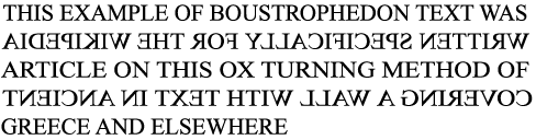
The Greeks had changed the way of writing from right to left, to left to right. They also wrote in a way called "Boustophedon" which I put an image that explains it quite simply below.
Week 3: Today's lecture was about letters and their "anatomy" in a way. Different features what they're called on a letter.
 Figure 1.2
A stroke is any line that would define a letterform, there are way more terms in the lecture all of which are displayed in the diagram above. Something I found interesting were small capitals. As I just thought they were a miniature version of a capital, but they are a different letterform from the normal capital version. It is usually used in acronyms such as TDS (Taylor's Design School). There are also lowercase numerals, lowercase numerals are typically in serif fonts. Uppercase numbers have the same kerning width.
Font characteristics and origins:
Week 4: Today we learned about tracking, kerning and letter spacing in more detail. There are different types of tracking:
<iframe src="https://drive.google.com/file/d/1SRHUC7ud9UmkeRZizf0CXgA7CxA376bo/preview" width="640" height="480"></iframe>


Feedback: Make the letter P push with the bowl instead of the tail for the word "Push". For "Fly" make the shadows smaller and for "Drown" change the font of the letters and bring the "water level" up higher.
I ended up doing this around three times due to a small but very noticeable issue I encountered. The issue being the large "H" would constantly jitter every few frames one or two pixels making it look oddly shaky.


Task 2 // Type Animation: This assignment was something I was actually excited for, as I already know how to animate and it is actually a hobby of mine. I was excited to add some life and character in just a piece of text, one thing I learned is that we shouldn't always do a flashy, amazing and cool animation but rather something that sends the intended message. The experience of this was quite interesting as I use Adobe Animate to animate rather than Illustrator and Photoshop. It was a new experience but not an unfamiliar one. I had some trouble specifically after I exported the Illustrator files to Photoshop. I realised the "H" was shaking very slightly. It bothered me to no end and I ended up moving each individual layer a few pixels to make it consistent and it worked! Overall this task was a fun experience, being able to give a few letters some expression and personality through movement is interesting. This reason is also why I really love animation, being able to breathe life into something that is so lifeless, it's just such an interesting experience.
Task 3 // Type Layout: This assignment was a bit more simplistic in terms of what to do in comparison to the animation exercise. However it was more difficult for me personally, especially because of all the small details that you could easily miss when editing the amount of text. Very small details all matter in this, especially things like tracking and cross alignment. The experience was definitely new but familiar, I had never used InDesign previous to this but it felt familiar as it was an Adobe product and I use Photoshop and Animate a lot. One of the troubles I ran into was more so carelessness, things I didn't notice until Mr Vinod had pointed out such as how I missed doing cross alignment on some of the pages and things of that nature. The overall experience wasn't difficult but it was very detail-orientated, even I consider myself very detail-orientated however this was a lot more than I was used to, but with practice hopefully I will be able to catch mistakes on my own without them being pointed out for me.


Ibrahim Fazal Ahmad / 0337423
Typography / Bachelor of Design (Hons) in Creative Media / Taylors University
Task 1: Exercises / Type Expression & Type Formatting
LECTURES
Week 1: Today we met our lecturers Mr. Vinod and Mr Shamsul. It was our first class and we learned a lot about illustrator and typography in general. We were told that typography is in almost everything, don't expect to choose something within the Creative Media and not expect it to be useful. Even outside of the creatives it is useful, such as marketing and business. We were given a brief run through of our module, and were immediately told it is one of the heaviest subjects. Also that we could easily fail if we don't do our e-portfolio so here I am! We then gave our e-portfolios and Mr Vinod looked through it and commented on things to improve.Mr Vinod then opened up illustrator and showed us a few new things and new terms when doing typography which are;- Kerning is giving less space between each letter,
- Letter spacing is giving more space between each letter
- Tracking is when both is used on one word.
After this we went to a zoom call with Mr Shamsul and learned the basics of illustrator, which was a little hard to keep up for me. After which we finished class and were sent away to work on our assignment.
Week 2: Today the recorded lecture was about development of typography. One thing sir said in the beginning was that anything we read or hear could be inaccurate and it depends on us and our levels of research. Try to research about local content as well. We looked at the formation and history of the roman letters. The way we currently write especially in the Roman and Arabic letters can be derived from Phoenician.
The Greeks had changed the way of writing from right to left, to left to right. They also wrote in a way called "Boustophedon" which I put an image that explains it quite simply below.
Figure 1: Boustophedon
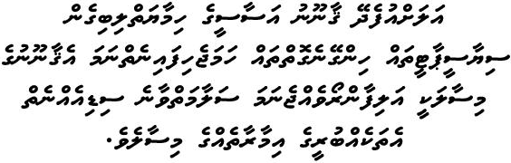
I found that interesting as some languages such as Arabic and even my own "Thaana" is still written from right to left while the current english alphabets and many more languages are written left to right. I thought it would be interesting to share some text from the Maldives as it is a very complex but almost unrecognised script. It isn't written in boustrophedon as when each new line starts it will continue from the right each time like Arabic.
Figure 1.1: The scripture of Maldives "Thaana" read from right to left
We had originally written in all uppercase letters, however we started writing in a more cursive style of scriptures for everyday transactions to increase speed and this is when lowercase letters had begun its development. Half-uncials are when the lowercase letters officially began, 2000 years after the conception of the Phoenician alphabet. The main forms of text were covered as well which are:
- 1450 Blackletter - Earliest printing type
- 1475 Oldstyle - Based upon lowercase used by Italian scholars for book copying
- 1500 Italic - Allow more words to a page
- 1550 Script - Attempt to recreate engraved calligraphic forms
- 1750 Transitional - Refinement of oldstyle
- 1775 Modern - Further refinement of oldstyle
- 1825 Square serif - Made for the newly developed needs of advertising
- 1900 Sans serif - Serifs were eliminated all together
- 1990 Serif/Sans Serif - A typeface that includes both serif and sans serif
- Baseline: visual base of letter
- Median: imaginary line defining x height
- X-Height: height of the lowercase x
- Ascending line: slightly higher than the capital line.
A stroke is any line that would define a letterform, there are way more terms in the lecture all of which are displayed in the diagram above. Something I found interesting were small capitals. As I just thought they were a miniature version of a capital, but they are a different letterform from the normal capital version. It is usually used in acronyms such as TDS (Taylor's Design School). There are also lowercase numerals, lowercase numerals are typically in serif fonts. Uppercase numbers have the same kerning width.
Font characteristics and origins:
- Italic: refers to the 15th century Italian handwriting
- Roman: their upper case forms are derived from Roman monuments
- Boldface: thick strokes but thicker than Roman form
- Light: thin strokes, thinner than Roman form
- Condense: condensed version of Roman
- Extended: extended version of Roman
One thing that was mentioned is that an amazing typeface doesn't need to be flashy and catch your eyes instantly, but rather it can fit into many situations. After the message of the text should be first, with the font being the icing on the cake. It doesn't matter if the text is amazing but the font looks terrible, most people would not read it.
Week 4: Today we learned about tracking, kerning and letter spacing in more detail. There are different types of tracking:
- Normal tracking - letter spacing and kerning
- Loose tracking - only letter spacing
- Tight tracking - only kerning
Letter spacing is typically only meant for uppercase letters together, and uppercase letters are meant to be able to stand on their own. This is why it's a debatable opinion on whether lowercase letters should be letter spaced as they were created with the counterform already in mind. Counterform is the black spaces between the white letters, the negative space.
Text alignments:
- Flush left - mirrors the experience of our own handwriting as we write left to right in most languages. It has ragging on the right. Ragging is the jagged end of the piece of text.
- Centred - imposes symmetry, has equal value and weight to both ends of any line and has ragging on both the left and right.
- Flushed right - places emphasis on the end of the line rather than the start, ragged towards to the left.
- Justified - imposes symmetry like centre, though there is no ragging, this can often lead to rivers of white space between the words creating a very odd look without tracking.
Type that calls attention to itself before the actual text is an interference and should be avoided all the time, different typefaces suit different messages and a good typographer can be able to recognise when to use a certain typeface.
INSTRUCTIONS
<iframe src="https://drive.google.com/file/d/1SRHUC7ud9UmkeRZizf0CXgA7CxA376bo/preview" width="640" height="480"></iframe>
TASKS:
EXERCISES: Type Expression
For this week we were assigned "type expression". We were given 6 words and told to express them using typography like this: BOLD, italic. We were given the following words: loud, drown, disappear, hidden, push and fly. I did a few sketches on Photoshop since we're in quarantine and I don't exactly have the most paper. I did around four designs for each word.
Figure 1.3: Sketches of my designs
Figure 1.4: First draft of designs
Figure 1.5: Reworked versions of type expression
Feedback: Make the letter P push with the bowl instead of the tail for the word "Push". For "Fly" make the shadows smaller and for "Drown" change the font of the letters and bring the "water level" up higher.
Figure 1.6: Final Type Expression PDF
After a small discussion with Mr Vinod I decided to animate the word "Hidden"EXERCISES: Text Animation
I ended up doing this around three times due to a small but very noticeable issue I encountered. The issue being the large "H" would constantly jitter every few frames one or two pixels making it look oddly shaky.

Figure 1.7: 33 frames used for animating
This was my first attempt of the animation, to show the issue I was facing:

Figure 1.8: Animation trial 1
As you can see, the animation was shaky. The H kept jittering ever so slightly and it leaves an odd effect on the animation as a whole. The solution was a bit primitive, I moved each layer individually on photoshop a pixel or two to align the letters and stop the jittering. After which this was my second attempt:

Figure 1.9: Final Animation
EXERCISES: Text Formatting
Our third task was to format text in Adobe InDesign, this was my first time using InDesign. The program was very nice to use and easy to follow.
Firstly, we had to make ourselves a name card. I didn't use my full name, I used "Fazal Ahmad", which is what I normally use. We had to choose a font that we thought represents ourselves well. I chose the font ITC Garamond STD Book Italic or Light Italic. I chose this font because firstly, I'm oddly fond of italic fonts, I feel their very simple, classy and oddly fancy. Not that I'm a fancy person, but the aesthetics of it is very pleasing to me. I made "Fazal" very slightly more bold than "Ahmad" because that is what I want to be called. I thought it would be a nice simple way to express that.

Figure 2: Name card
Next we had to add our details on the "back" of the card. Our name, address, phone number, email and website. We had to make four variations of it, personally my favourite out of the four is the card one the bottom left.

Figure 2.1: Back of name cards

Figure 2.2: Name card measurements.
I tried using the ruler to make the name card look more appealing and have a the looking that each row is a staircase row. I also chose to make my name bolder and italic to stand out among st the text. I made the body text normal as it is the important part. Lastly I made my website italic and thin, as it is a bit more of an afterthought compared to the rest of the information. Lastly we had to write a little write up about ourselves and edit it into a letter format.

Figure 2.3: Letter formatting
We did this exercise during our own time and then continued with Mr Vinod during the Friday class. Firstly we did a letter front mock-up.

Figure 2.4: Letter mock-up
Next we learned about creating columns and rows in InDesign. Firstly we had to make page with 4 rows and 2 columns, then a page with 3 rows and 8 columns and lastly 3 columns, 8 rows and the top margin would be 50mm. Then we had to right click each page and turn off "Allow selected spread to shuffle" OFF. Then drag the pages and put them next to each other.

Figure 2.5: Columns, Rows and Margins.
Next we had to edit text more towards a piece of writing that you would read, with a head line, subtext and body text. We made two following Mr Vinods instructions and then one of our own. We learned a few terms doing this being:
- Crossalignment: baseline is the same across the columns
- Rivers - Justified text without letter spacing and kerning, we were told this is a guaranteed way to lose marks very quickly.
Figure 2.6: First version of text layout
After the feedback I had made the changes required.
Figure 2.7: Type Layout Final
FEEDBACK
Task 1 // Week 1
Specific Feedback: I had shown my six designs and got some very helpful feedback. First was push and they said to put the "P" vertical and tilt it to make it look like it is pushing the "ush" into the corner. Loud was a little confusing, it looked like a smiley face according to them. I wanted them to look like headphones, didn't translate however and was told to try the bottom left design of loud. Hidden was great and required no changes. Fly was just not working, and I was told to choose the top left design of fly. Drown was also a little confusing, a bit more like sinking. I was told to make the "O" look like it is drowning and below the rest of the letters with bubbles coming from the "O". Lastly was disappear, they said the idea was good but just a bad choice of fonts and to change it.
General Feedback: Some general feedback that we all had gotten was that many of us had sketches that were too dark, it seemed pretty consistent among us. I used photoshop to sketch so I didn't have that problem. Another one was to not screenshot and not stretch the typefaces.
Task 2 // Week 2
Specific Feedback: Mr Vinod said that the animation was excellent and well done. That I also used something from the "sink" tutorial video he used. He said it was very good and that no changes were to be made.
Task 3 // Week 4 - 5
Specific Feedback: The namecards were good, letter spacing, kerning and expression of my name was good. However I used light a lot throughout my pages and I should try not to use it as it can be hard to read but on the namecards it was fine as the point size was large. But it is usually not advisable for small text. I was also told not to use italics as body text and change it to roman. I also used right align and left align in one piece of work and was told not to do that and just use the left align only. Overall I made quite a lot of small mistakes and it costed me quite a bit to be honest, I was a little disappointed in myself because I usually don't do small mistakes like these. But with mistakes always comes improvement and I will try to succeed in this.
General Feedback: Overall sir said he was a literally worried whether we actually watch the lectures and videos, it is a lot of information and he's just a bit worried. Also quite a lot of people hadn't changed their tracking and kerning from 20 to 5 and that caused a lot of people to have a lot of extreme letter spacing and kerning in their pieces of text. Also the maximum letter spacing we can use it 15 and maximum kerning is -15. We should also make sure our e-portfolio is being updated and everything is visible because some files are not visible on some peoples websites.
REFLECTIONS:
Task 1 // Type Expression: When we got this assignment I immediately knew it was not a simple task. Though it is deceivingly simple, coming up with an idea to reflect a words meaning using only typography was very difficult. The general experience was a little hard as I felt a little bit restricted in my options but I think that it is useful sometimes to allow creativity to grow. One observation I made was that everyone had rather similar ideas but we all expressed them very differently, from our use of fonts and sizes of the letters. I also noticed that very little can go a long way at times, and complexity isn't the most important factor in design at all but rather it is being able to allow the audience to pick up what you are throwing down. I found that we had to play with the blacks and whites and even give hints as to what the word could be designed as, such as the bubbles above an O to mimic it drowning. It allows our brains to fill in the blanks for a very simplistic design and I thought it was very interesting. Overall I really liked this task, it was hard but to be honest I don't really think anything in the design world is easy and this would pale in comparison to the even higher mountains we need to climb.
Task 2 // Type Animation: This assignment was something I was actually excited for, as I already know how to animate and it is actually a hobby of mine. I was excited to add some life and character in just a piece of text, one thing I learned is that we shouldn't always do a flashy, amazing and cool animation but rather something that sends the intended message. The experience of this was quite interesting as I use Adobe Animate to animate rather than Illustrator and Photoshop. It was a new experience but not an unfamiliar one. I had some trouble specifically after I exported the Illustrator files to Photoshop. I realised the "H" was shaking very slightly. It bothered me to no end and I ended up moving each individual layer a few pixels to make it consistent and it worked! Overall this task was a fun experience, being able to give a few letters some expression and personality through movement is interesting. This reason is also why I really love animation, being able to breathe life into something that is so lifeless, it's just such an interesting experience.
Task 3 // Type Layout: This assignment was a bit more simplistic in terms of what to do in comparison to the animation exercise. However it was more difficult for me personally, especially because of all the small details that you could easily miss when editing the amount of text. Very small details all matter in this, especially things like tracking and cross alignment. The experience was definitely new but familiar, I had never used InDesign previous to this but it felt familiar as it was an Adobe product and I use Photoshop and Animate a lot. One of the troubles I ran into was more so carelessness, things I didn't notice until Mr Vinod had pointed out such as how I missed doing cross alignment on some of the pages and things of that nature. The overall experience wasn't difficult but it was very detail-orientated, even I consider myself very detail-orientated however this was a lot more than I was used to, but with practice hopefully I will be able to catch mistakes on my own without them being pointed out for me.
FURTHER READING
Butterick's Practical Typography 2nd Edition // https://practicaltypography.com/why-does-typography-matter.html
Figure 2.8: Butterick's Practical Typography 2nd Edition
So why does typography matter? Honestly I didn't think there was this much depth and precision in typefaces. I didn't know there was so specific parts of a letter there could basically be an anatomy book on it. It's all around us and it keeps the readers attention. A really good example given in this was would you go to a job interview in a swimsuit and flip flops? No, right? Then why would you use a terrible typeface when that will the immediate first impression on your readers. Sure your writing might win you an award due to its substance, but can people really tolerate it when it's bright green and in Comic Sans? Often times we need to make rash decisions, when you have two options given to you and have no time to read its substance, you will obviously judge it based on the design and typeface. Judging a book by it's cover is harsh, but why is the cover there in the first place? To draw your attention and keep you interested enough.
Typography: A Vital Component in Advertising // https://www.evokad.com/typography-a-vital-component-in-the-world-of-advertising/
Typography: A Vital Component in Advertising // https://www.evokad.com/typography-a-vital-component-in-the-world-of-advertising/

Figure 2.9: Typography: A Vital Component in Advertising
Typography is made to be read so this article shows a few of the most important things when it comes to typography on the web. Contrast, make sure that the text is visible, you can take an image and turn it to grayscale to see the level of contrast much better. The size of the text is also important, if it's too small who would bother reading it? Hierarchy in text is also important, you wouldn't make the title 12px meanwhile the body text is 16px, it would look very confusing and wrong. Hierarchy is there to make sure this doesn't happen. Organising the text based on size is a great way to create hierarchy. Lastly, space. I'm going to do a quick analysis on a picture I found about its typography.
Figure 3: FishFacTory
This is clearly bad typography, there are so many unnecessary capital letters, where do you even look first? Thing can be out of centre and look okay, but this is not one of those cases. The words "fish factory" are so close together yet also have inconsistent kerning spaces. This is just a huge mess.
Vignelli Canon on Design //
Figure 3.1: Vignelli Canon on Design
Discipline in typography, to me makes a lot of sense. This subject is already so precise and exact, the whole point is making the details perfect whether it is cross alignment or tracking. To me I think this is best displayed if people don't notice anything about the typography in particular other than it is good. If people begin noticing the typography more than the actual text, the discipline shown is very poor. Whether it is because of the sloppiness or the poor choice in font, it can ruin a piece of text so quickly. That's why discipline is so important, being able to commit yourself to following a set of rules and shows irresponsibility when taken as a joke.

Comments
Post a Comment