Typography - Project 2B
TYPOGRAPHY - PROJECT 2B
12/06/20 - 17/07/20 Week 9 - Week 14
Ibrahim Fazal Ahmad / 0337423
Typography / Bachelor of Design (Hons) in Creative Media / Taylors University
Project 2B - Typography: Expression, Hierarchy and Composition
<iframe src="https://drive.google.com/file/d/1SRHUC7ud9UmkeRZizf0CXgA7CxA376bo/preview" width="640" height="480"></iframe>
INSTRUCTIONS
<iframe src="https://drive.google.com/file/d/1SRHUC7ud9UmkeRZizf0CXgA7CxA376bo/preview" width="640" height="480"></iframe>
TASKS:
This weeks task is to make a protest sign/poster which we will animate afterwards. It can be about anything and express your own views. I was struggling to think of a line that was somewhat original and I ended up coming up with: "Religion is not a synonym for your prejudice." I chose this phrase because I feel like people use their religion and as a way to express their own hatred and discrimination towards people they don't like and just use the excuse "It's in my religion". It's a misrepresentation because they're using their own feelings to justify their hatred which I think is awful and should be called out on. I had one idea which was to make one those posters that look like dictionary definitions since that's what the phrase slightly references when talking about synonyms
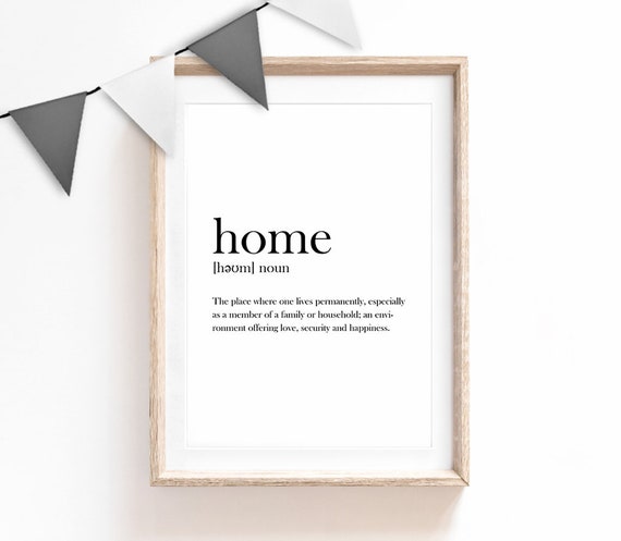
Figure 1: Reference

Figure 1.1: Reference
I did a few versions of this in different fonts and I also did one other design that was just off the top of my head.
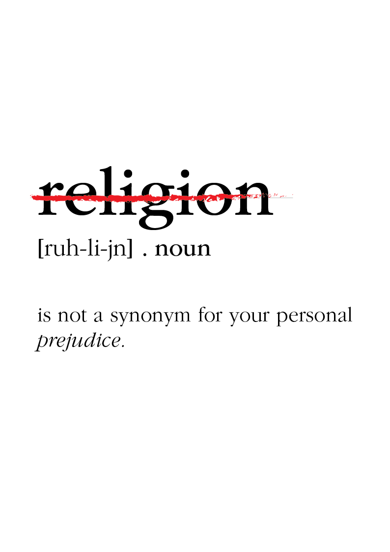
Figure 1.2: ITC Garamond Std

Figure 1.3: Serifa Std

Figure 1.4: Univers LT Std

Figure 1.5: Design 2, Univers LT Std
After feedback on design 1, in ITC Garamond Std I tried making 3 more designs but to emphasise on the word religion more while keeping the dictionary definition design,

Figure 1.6: Design 3

Figure 1.7: Design 4

Figure 1.7: Design 5
Design 3 was chosen and I was told to include the synonyms of "prejudice" in the poster and maybe.

Figure 1.8: Design 6

Figure 1.9: Design 7
I personally like design 7 the most, I asked a few friends and they said it looks much more impact and almost "evil" looking and I really liked the general vibes of the design. It feels very strong and I like how the rest. I will update this after a few more variations to really make sure this final design is the best possible submission I can do for this project.

Figure 2: Design 7 variation
In this version I allowed the darker words in the background to continue through along the back of the poster which I like a lot more, there is a lot more cohesiveness and it doesn't suddenly stop at the bottom. Since the white text is larger, different font and well, white. It stands out against the text and doesn't class with it.

Figure 2.1: Design 7 variation
In this version, I added some red words on the left and right to connect the letters on the side. I asked a few friends and they said it was harder to read the "I" and it looks a bit weird.

Figure 2.2: Final Poster
In this I just changed the word "RELI" slightly by moving it up so there isnt a very small line of cut off red text along the bottom. I personally think this is the best version I did and I really like it. This is the final version.

Figure 2.3: Design 8

Figure 2.4: Design 9

Figure 2.5: Design 10
In design 8 I tried to make it look like religion and prejudice were each others shadows, implicating how some people use it. For both design 9 and 10, I wanted to follow how holy books often focus on the centre by framing the G in the centre. I was told design 9 was almost done, just make the words "REL" bigger and try to add paper texture in the back to match scriptures.

Figure 2.6: Final Version 1
The poster is good, just change the paper texture to something less strong and more paper looking as this one looks a bit too overwhelming.

Figure 2.7: Final Improved Paper
For the animation, I had the idea of making the text look like it was being burned or revealed into the paper. Almost like a revelation coming to us since the general idea of this was based on religion and revelations are quite significant in them. I did one sudden frame of orange right before the black to really catch someones eyes and also make it look a little glitched.

Figure 2.8: Animation First Version.
I was told to just add some texture to the word "RELIGION" by exporting the text into photoshop and overlaying the paper using a clipping mask. After which I just export it back into illustrator. The animation is good, no changes need to be made. After that I am DONE with Typography!

Figure 2.9: Final Poster PNG
Figure 3: Final Poster PDF

Figure 3.1: Animation of Final Poster
FEEDBACK:
Week 10: Mr Vinod said that the design and idea is good, but that I need to add more impact to the poster as it feels very lackluster overall. Also to emphasise on the prejudice aspects and its synonyms.
Week 11: I was told the poster has no impact and I shouldn't restrict myself so much on just one design every time.
Week 12: The poster is good and well done, just overlay the paper texture onto the text to give it a more papery feel. The animation is well done and it conveys my idea of it being a revelation coming from God.
REFLECTIONS:
Week 10: This project was much more simple compared to what we've been through in the earlier weeks of typography, I wanted to do a simple design that was a concise and was just a statement and I didn't feel it needed a lot of flashy colours, design or text. The text is supposed to stand out with it's meaning and not the actual typography itself according what we've learned and what I've read over the weeks. The experience overall wasn't very difficult in comparison to previous weeks. An observation I made is that there is very minimal uses of sans serif fonts in these type of dictionary definition posters, almost non-existent. One finding I made was that protest posters are never this organised and clean, they're made for a protest and they want the words to speak louder than the beauty of the typography.
Week 11: This week I was a little frustrated because I thought the poster I had done was pretty good but I was told it had no impact at all. Personally I still feel like the old poster is better but I'm a student for a reason. Sometimes simplicity is enough in the case with my poster. The experience has been fine, it isn't particularly difficult or anything. One observation I made was that there are many aspects to these posters done by professionals that I just can't understand, the amount of detail and nuance is amazing. One finding I made was that you can actually stretch the text sometimes, if it works and tells a point, but we need to follow the rules before we can break them.
Week 12: This was my final project finished. I am done with Typography and it feels really weird to be honest. No more staring into illustrator for 3 hours trying to squeeze and idea out of my already fried brain. It really was nice to finish on a high note, sir said the animation was perfect for my message and I was so happy. The experience was great this week because I love animation, figuring out ways to express something using movement is always so interesting to me. An observation I made was that typography is usually quite simple and just expresses the word. A finding I made was that religion is very very heavily avoided in typography. Religion is a extremely touchy topic and I'm glad I decided to use it because not enough people talk about this. Using religion as an excuse to be a hateful person is wrong, mind your own business and let people live without butting into their business. As long as they're not harming someone, it doesn't concern you. That was a little off topic but, thank you for following me through these weeks of typography! I hope anyone who actually reads my blog enjoyed my struggles and frustration.
FURTHER READING
Typography Basics:

Figure 3.2: Typography Basics
Font categories, there are a lot more than serif and sans serif apparently according to this book. According to this, it says that two are too broad to describe the vast sea of different fonts. There are 7 listed in this being:
- Serif
- Sans Serif
- Mono-spaced
- Display
- Script
- Text
- Dingbats
Serifs are the common body fonts nowadays, they have the little tails that hang off the end of letter strokes and are considered the easiest to read.
Sans serifs are without serifs (as the name implies). They have an overall even stroke width they look more modern but are considered harder to read.
Mono-spaced fonts are proportionally spaced. They will take up the same amount of space regardless of the actual size of the letter. Such as the letter "m" and "l", though they are differently sized they would take up the same amount of space in a mono-spaced font.
Display fonts are supposed to be attention grabbing and should not be used as body fonts due to how in your face they are.
Script fonts are mimicking our handwriting and are usually touching each other because of that. Usually used on formal invites They should NEVER be used in all capitals unless you want someone to instantly throw your piece of work into the garbage.
Text fonts are based on hand drawn letters and have a old world feel to them. They are usually used on certificates and should also not be used in all capitals ever.
Dingbats are small pieces of art for enhancement of the page. The book didn't explain much on this so I did a little more digging and found that: in the world of printing they were used as an adornment of sort for the printer and are also used to end a chapter or section in a book.


Comments
Post a Comment