Advanced Typography - Project 1A
ADVANCED TYPOGRAPHY - PROJECT 1A
23/09/20 - 30/09/20 / Week 5 - Week 6
Ibrahim Fazal Ahmad / 0337423
Advanced Typography / Bachelor of Design (Hons) in Creative Media / Taylors University
Project 1A / Key Artwork
LECTURES
Lecture 5:
Perception & Organisation
Perception in typography deals with the visual interpretation of the reader by contrast, form, and organisation of the information. It can be textual, visual, graphical, and form of colour.
Contrast was being discussed, we looked at this aspect during our first semester in Typography. Some examples of contrast would be:
Light/Bold
Red/Blue
Serif/Sans Serif
There are more, however those are some of the simplest ones. Contrast is important for the reader to be able to separate information. It creates a sort of hierarchy. Carl Dair, adds two principles to the given 5, the 7 being Contrast of:
- Size - Common uses of size are making title headings noticeable bigger than the body text. It draws the reader's attention.
- Weight - How bolder type can stand out among lighter type of the same style.
- Form - Difference between capital letter its lowercase pair, or a roman letter and italic variant. Condensed and expanded, these are all contrasts of form.
- Structure - Different letterforms of kinds of typefaces. Like an italic and a blackletter.
- Texture - Contrasts of size, weight, form, and structure, and applying them to a block of text. The way the lines of type look as a group, up close and from a distance.
- Colour - Considered less "emphatic" meaning less emphasised than the usage of just black and white. Colour needs to be used carefully.
- Direction - Between horizontal and vertical, the angles in between as well.
Form is the overall look and feel of everything in the typography composition. Good form in typography is usually pleasing and intriguing to our eyes. Leads the eyes from point to point, a smooth flow.
In Typography, a form can be seen to either represent a concept or to do so in a visual form. Displaying type as a form gives an abstract feel and allows a letters unique characteristics to shine. Meaning and form bring harmony, when a typeface is seen as a form it is no longer seen as a letter because of the manipulation.
Gestalt theory emphasises the whole of anything is greater than its elements. The psychology behind it, explaining you look at the whole experience rather than the details. In detail, the components are only as good as the entirety of the form and visual appeal. Each element may not hold much weight alone, but together as an artwork, it can change completely.
We actually did this during semester 1 in Design Principles, so it is interesting seeing this again.
Laws of Gestalt:
- Similarity - elements that are similar tend to be perceived as a uniform group.
- Proximity - elements close together are seen as a unified group.
- Closure - The minds tendency to complete figures even if the picture is not complete.
- Continuation - Humans perceive each of two or more objects as uninterrupted even when they intersect.
- Symmetry - Elements that are symmetrical tend to seen as a unified group.
- Simplicity - Elements are always perceived in the most simple way possible.
INSTRUCTIONS
Project 1A:
Finally, we are at project one after all the exercises. For this project, we are told to create a key artwork based around the 3 titles we were given at the beginning of the semester for our Task 1. The titles being:
- All Ripped Up: Punk Influences on Design
- The ABCs of Bauhaus Design Theory
- Russian Constructivism and Graphic Design
We had a quick briefing about this online after our feedback session for Type & Image. Basically we need to do a key artwork, no dates or names. Just the title as it's own artwork and have a series of designs based around it created (which will be our future projects)
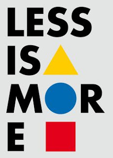
Firstly, what I did was do some research on Bauhaus and watched a video about the theories and principles behind it. After which I did some visual research on Pinterest and found a few interesting posters as inspiration.
Figure 1: Reference 1 (21/9/20)
Figure 1.03: Reference 2 (21/9/20)
Figure 1.02: Reference 3 (21/9/20)
Figure 1.03: Sketch 1 (21/9/20)
Figure 1.04: Sketch 2 (21/9/20)
Figure 1.05: Sketch 3 (21/9/20)
After doing my sketches I digitised the following designs and added some colours following roughly to the colour schemes of the reference pieces. I used only Univers as I felt it was a fitting font for the designs.
Figure 1.06: Design 1 (21/9/20)
Figure 1.07: Design 2 (21/9/20)
Figure 1.07: Design 3 (21/9/20)
After our feedback session, I really needed to rethink my designs and do some research about Bauhaus Design. I read a few articles and watched a few videos on the emergence and importance of Bauhaus. I realised there were many iconic designs that came from the Bauhaus period. Such as architecture and typography. I reworked my poster designs into something that could be more easily used as a form of branding. I did both black and white along with the coloured versions.
Figure 1.08: Design 4 (24/9/20)
Figure 1.09: Design 5 (24/9/20)
Figure 1.1: Design 6 (24/9/20)
After doing these designs, I realised I wasn't really experimenting with my designs or trying to really push myself to make something different. So I looked into the Bauhaus creations and tried to extract some designs using, by extracting simple shapes and such from them to make an iconic key artwork inspired by Bauhaus creations.
Figure 1.1: Bauhaus building (28/9/20)
The building above was one of the most recognisable things from the Bauhaus period, the actual Bauhaus building. With this, I tried to make a key artwork by simplifying the building with key shapes. I don't really think the design works that well personally, but I kept it as experimentation.
For my next design, all I did was a very simplified B using only 3 shapes. It was inspired by the basic 3 shapes and colours constantly used as a symbol for Bauhaus. I kept it simplified to stay true to the Bauhaus Design.
Figure 1.13: Design 9 (28/9/20)
Figure 1.14: Multiple variations on Design 9 (30/09/20)
Mr Vinod circled the bottom left design as the best variation and said to make the text "Bigger".
Figure 1.15: Design 10 (30/09/20)
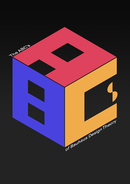
After increasing the text size, he said to move the word "theory" up to the same line as "design". I reduced the size as the large text was making the key artwork feel very tight and crowded.
Figure 1.16: Design 11 (30/09/20)
Figure 1.16: Key Artwork FINAL PDF (30/09/20)
FEEDBACK
Week 5 // Project 1A: The designs are not really working, do some more research into Bauhaus Design Theory, and try to understand its principles better. I can keep the same design, but also keep making more designs and experimentations with my design. See how far I can go with the Bauhaus Design Theory. Generally, these are key artworks, not posters. Don't use backgrounds. They're supposed to be an artwork that can be used multiple times, almost as a logo and staple for said brand or event.
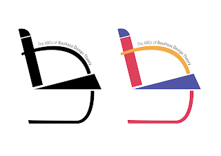
Week 6 // Project 1A: Design 6 is the most interesting one. Is captivating due to its simplicity, the key artwork is fine, change the text placement to fit it better a be more "square" by moving all the text to just one side. After moving all the text to one side, Mr Vinod just said to make it bigger.
REFLECTIONS:
Week 5: Doing research into Bauhaus I realise it's actually quite an in-depth and interesting topic. About how important simplicity is and how it was politically motivated. Overall making these designs were quite hard, especially because in terms of Bauhaus there is quite a limited amount of things you can do to keep within the theme. Due to this, it can end up being quite unoriginal or similar to other peoples works. One observation I made was that Bauhaus designs always emphasise the usage of the 3 primary colours and 3 shapes (circle, square and triangle). One finding I made was that the Bauhaus designers tried to make a sans serif font to go against the "German font" as a political move as the font was heavily serif and considered the font of their country.
Week 6: This week I was expecting one of my designs to be better than the others just because it had a lot more meaning and research behind it. But after my feedback session, I realise that simplicity is often very overlooked and that it doesn't need to be a super complicated design or anything. Just a simplistic design is oftentimes enough. One observation I made was that there are a lot of designs in architecture and interior architecture that are descendants for the Bauhaus movement. One finding I made was that the BRNO chair has still retained its design from conception.
FURTHER READING
The ABCs of: The Bauhaus Design and Theory:
Bauhaus design was a revolutionary moment in design, it is used in modern graphics, industrial and architectural designs. It was a wall broken at the time between fine art training and crafts instruction. Rather than these being separate, students were taught the fundamentals of design which could be applied to any of the design worlds whether it be sculpture, architecture or lettering. It was almost as though the artists just took a step back and really analysed what they were doing, they reduced everything to its simplest form and fundamentals. Bauhaus was beauty in simplicity and fundamentals, and it has affected generations after its conception.
Vignelli Canon on Design // Pg 28-29 // Timelessness:

Figure 1.08: Vignelli Canon on Design
The book talks about how we as designers, should hate the idea of wastage. Design should be made to last, with timelessness and age with grace. How we should avoid making designs for design's sake but rather to last throughout its time. The usage of primary colours and its simplicity is one of the reasons it lasts for so long. We value simplicity in typography and shapes, and that enforces its longevity. Trends will fade, but the primary values of design will always stand the test of time.


Comments
Post a Comment