Interactive Design - Project 3
INTERACTIVE DESIGN - PROJECT 3
15/10/20 - 29//10/20/ Week 10 - Week 14
Ibrahim Fazal Ahmad / 0337423
Advanced Typography / Bachelor of Design (Hons) in Creative Media / Taylors University
Project 3
INSTRUCTIONS
WEEK 10 (PUBLIC HOLIDAY): For our final project, our task is to create a 5-page website for our partner. My partner for this project is Jon and what he requested was a portfolio website that will display his website along with commission information as the main content. Firstly, we discussed what we wanted to see from each other, as I also had to describe to him what I wanted.
WEEK 11: Here is the presentation I had created for this project:
Figure 1: Website Proposal

Figure 1.01: Landing Page 1

Figure 1.02: Landing Page 2

Figure 1.03: Landing Page 3

Figure 1.04: Artworks 1

Figure 1.05: Artworks 2

Figure 1.06: Artworks 3

Figure 1.07: Artworks 4

Figure 1.08: Commissions 1

Figure 1.09: Commissions 2

Figure 1.1: Commissions 3

Figure 1.11: Contact Me

Figure 1.12: About Me
WEEK 12: I can now begin on my prototyping for the website. Jon had given me a colour scheme along with a font that he wanted me to use:

Figure 1.13: Colour Scheme
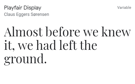
Figure 1.14: Playfair Display, chosen font
Using this, and his mood board of simplistic and minimalistic websites, I created his portfolio prototype. I wanted his artwork to be the main subject when landing on any of the pages. I also kept most of the text strictly lowercase, as it added a stylistic flair and emphasises the simplicity aspect.

Figure 1.15: Landing page

Figure 1.16: Artworks (Compressed as the original file was too big)

Figure 1.17: Commissions

Figure 1.18: About Me

Figure 1.19: Contact Me
This is everything finished, however I did also do a separate version using the turqoise and dark green rather than the two shades of brown I used here. The green version looked exactly the same, just a colour difference.

Figure 1.2: Landing Page (Turquoise Version)
WEEK 13: For the creation of my website. I began with my Landing Page first. I used Bootstrap along with my own external CSS. I started with my landing page. The layout was rather simple, with 3 sections. The landing page itself with the CTA, the latest works he has, and his social media links along with the footer. My coding for the navbar remained the same throughout all my pages, I made it each page on its own HTML file and it is linked through the href.

Figure 1.2: Navbar for all pages.
After completing the navbar, I had to move onto the landing page, which is also the same across all my pages, with differences in words and images only. The actual row layout is the same. I used a row divided into 2 sections, both being 6. I would use the right side for an image, which I made the background of the div to fill up the whole page. Along with simple text on the left side, exceptions being the "About Me" and "Contact Me" pages as they were only one section long.
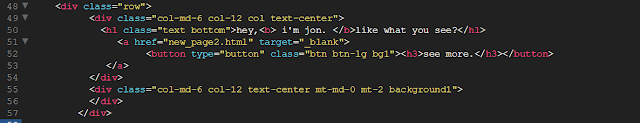
Figure 1.2: Landing page code, roughly the same for all 5 pages.
Below this is the "Latest Works" section, this section is also divided into 2, with each one having one image each. The title for the section is outside the row.

Figure 1.2: Latest work section
The next section was the social media links, which also follows the same process as this. So I will just show the footer coding next as it's slightly different. For my footer, I used a jumbotron which was what I had used for my footer on my Project 2 as well. Inside I divided it into 3 sections. The middle section having Jons logo and watermark, while the left section has his social media links and the right section is empty.

Figure 1.2: Latest work section
I used this process but changing it to fit the needs of each page such as the artworks section being divided into 3 and each section contains 2 artworks. Most of my coding is a variation of the ones from above. I have finished the website and here is the final outcome: Final Project // Jonathan Tirtajaya
FEEDBACK:
WEEK 11: Add section titles in the artworks sections for organisations. Everything else looks good to go, begin your prototyping for the actual website.
WEEK 12: Mr. Shamsul said that the turquoise version looks better than the brown version, to which I agreed. However, it is Jons final decision on which he prefers more. He also told me to make sure I keep the website consistent across all the pages. Such as the "my latest works" on the landing page has a background, while the rest of the text does not. Other than that, everything looks good and I can begin the website creation.
WEEK 13: The website looks good, it's still incomplete. Fix the alignment issues in the website, consistency issues.
REFLECTIONS:
WEEK 11: This week I created the wireframe for Jons website which was rather simple. He wanted to for a very minimalistic look on his website so I tried following that as best as I could in the wireframe. I had actually worked with Jon for a commission outside of university before, where I drew him something. So we've already done something similar to this and understood the general process relatively well. We're also friends who talk very frequently which made communication on the project really easy and led to no real difficulties. One observation I made was that a lot of very simplistic websites often rely on non-objective elements and imagery. One finding I have made was that simplicity and minimalism is very popular now, with most websites following it to a certain degree.
WEEK 12: I have created the prototype for Jons website now, which was rather simple and quick. I did struggle a little bit in terms of colour palette, as I tried including all the colours given at first which I realised was not really possible. The colours of green and reddish brown have high contrast, so I just ended up separating them into their own versions for the website which worked out better. One observation I made was that I had a small issue with consistency when creating websites, typically I apply the idea of consistency through my work but it seems to be a slight weakness of mine here. One finding I made was that many portfolio websites are rather individualistic, to express the artists uniqueness.
WEEK 13: This week I started making the website on Dreamweaver, I had made all 5 pages but not everything was complete. There were still quite a few small issues, with alignment and text placement. I knew what to fix already, so my feedback session was rather short as I just needed to finish and finalise the website. One observation I have made was that Dreamweaver is actually a lot more simple when you really understand what you're doing. If I'm being honest, Project 2 was not the best because I really felt lost at times. One finding I have made is that Dreamweaver can support multiple files being linked together very simply.
WEEK 14: Website is now done, well I hope so. There are probably some minor improvements to be made after consulting with Mr Shamsul one last time. This semester has been really tough honestly, and I can say Interactive Design was on the harder side of the modules this time around. After finishing the website, I looked back at my first exercise of the semester. I realised I had actually improved and learnt so much than I was expecting, if I had seen my prototype website in Week 1 I would've thought I was insane for doing something like that. I'm glad I can see a large improvement in my skills in comparison to when I began, though I am nowhere near good yet. One observation I have made was that I actually take a rather long time to learn coding. I was very slow at first within the first few weeks and needed help from Jon quite often. Thankfully I started picking up the pace towards the end and became more independent. One finding I have made is that Dreamweaver is an extremely useful tool for creating websites. I know, that is it's whole job, but when using it during school it felt old and restricting as we had to follow such specific rules and instructions. However, in university it really showed me how much potential is in this application.


Comments
Post a Comment