ART DIRECTION
Ibrahim Fazal Ahmad / 0337423
Information Design / Bachelor of Design (Hons) in Creative Media / Taylors University
INSTRUCTIONS
EXERCISES:
Here is a link to our group (Group 4)
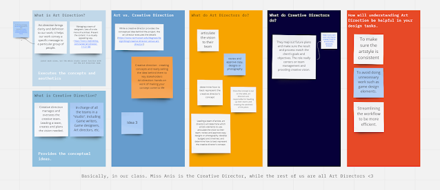
Miro board. It has all progress from Exercises to Final presentations. Along with the link to our Google Drive folder with our Final Project as well. In Art Direction, we are to redesign a game visually. The game we were given is "Among Us".
Flip Classroom:
Week 1:
Week 2:
Good & Bad Art Direction - Among Us:
Proposal:
Week 3:
For Art Direction, our task is to visually redesign a video game into any style that we would want. We have to keep the game the same but just redesign it visually. I was the group leader with my three members: Jon, Shayor, and Yumnu. Three of us are from Entertainment (Me, Jon, & Shayor) and Yumnu is from New Media.
The theme we decided on was "Film Noir". I was the one who suggested it because I had been looking into old black and white movies just around then. I felt it was a unique and interesting theme we could look into, it's a very specific aesthetic that employs the usage of strong lighting and darkness.
Here are the ideas that we came up with for the game concept. The first one would be a full-on 2D game played only from a side new.
Figure 1: Among Us Redesign Idea 1
The second one would be a first-person view of the game. This one would be much more horror-like and scary to play but it would be the most difficult to pull off.
Figure 1.1: Among Us Redesign Idea 2
Lastly, is a top-down 2D/3D game. Similar to the current way Among Us is played except it is somewhat 3D with overlapping objects and such. We wanted it to still be scary so there is a specific FOV that the players can see inside. Only inside said FOV can they see other players.
Figure 1.3: Among Us Redesign Idea 3
Week 4:
Proposal Presentation:
This week we had our proposal presentation. Jon, Shayor, and I will focus on the visuals. While Yumnu will be focusing on the UI/UX side of things. I will also help with everything in general as the leader.
Figure 1.4: Proposal Presentation
Week 5:
This week we discussed the visual style we wanted to go for in our version of among us. Here is an example of the lighting we would like to achieve. The style is quite different from what we are aiming for. We want to go for a rather simplistic style, especially for the character design.
We've also decided on 3 map locations being: Apartment, Train station & Police Precinct. We chose these locations because they are usually common tropes/places in Noir films.
Figure 1.5: Reference 1
Figure 1.6: Reference 2
Week 6:
For this week we created an isometric grid that we will follow during the creation of our maps. Our first task is to create the overhead view sketches. We also had a sketch for the character customisation screen made.
Figure 1.7: Overhead Map (Train Station)
 Figure 1.8: Overhead Map (Apartment)
Figure 1.9: Character Customisation Screen
Week 7:
Continued working on the assets by ourselves. No meetings this week. Below was an attempt at creating the overhead map view for the Precinct done by myself. I realised it was not the best and sent it over to Jon instead as his overhead map looked better.
Figure 2: Overhead Map Idea (Precinct)
 Figure 2.1: Overhead Map Final Sketch (Precinct)
Week 9:
This week we focused on the character design of the main character. I did the sketches/designing of them. We also focused on colour variations and different styles of blood effects. The colour choice that we chose was number 4. It fit the noir theme the best. Noir is always well, "noir". But colour is very vital in Among Us so we opted for something more muted as it fits both themes well.

Figure 2.2: Character Design Ideation
Figure 2.3: Dead Body Ideation
 Figure 2.4: Character Design Minor Details
 Figure 2.5: Colour Scheme Ideation
We also had a sketch of the main menu from Yumu. It is a dark and suspicious alleyway, with strong lighting that will show the title of the game in the centre.
Figure 2.6: Title Screen Sketch
Week 10:
This week we created a map in the police precinct and attempted base colouring/shading. This is the sketch I did for the map. It is supposed to be inspired by those dark rooms that were used to develop photos in the past. I thought it'd be an interesting location due to the darkness and minimal lights.
Figure 2.7: Line Art of Precinct
 Figure 2.8: Lighting Set-up 1
 Figure 2.9: Lighting Set-up 2
Figure 3: Lighting Set-up 3
 Figure 3.1: Lighting Set-up 4
Week 11:
With some help from Ms Anis, we changed the map layout slightly. I explained that I was struggling to lead the group in a solid direction map design-wise. I did not know why but I felt the map I designed was not good and confusing. She explained that the current view we have a very restricted and small. We expanded the general view of the player and added in half-walls to be able to see into the rooms better with her advice.
 Figure 3.2: Expanded Map
Week 12:
Below are some skin designs that were done by Shayor.
Figure 3.3: Skin Designs
This also shows the map designs that Jon had come up with. I asked him to further develop two of the maps with line art and colour. We had a character in the centre at all times to make sure the proportions would be the same among the maps. Such as the rough sizes of objects and doors.
 Figure 3.4:Electrical Room (Train Station)
 Figure 3.5:Hall (Train Station)
Figure 3.6: Electrical Room Coloured (Train Station)
 Figure 3.7: Hall Coloured (Train Station)
 Figure 3.8: Train (Train Station)
 Figure 3.9: Hallway Coloured (Train Station)
Week 13:
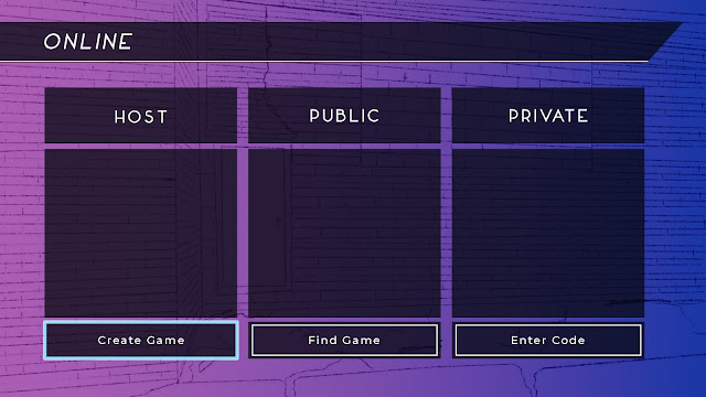
Game creation screen menu ideation is done by Yumnu.
Figure 4: Game Creation Screen
Here is the edited sketch for the police precinct map as well. I edited it so there were half walls and also show the inside of the holding cells.
 Figure 4.1: Precinct Line Art
 Figure 4.2: Precinct Colours
I also did an animation of emergency meeting animation. It was also the same animation for the dead body reported.
Week 14:
Figure 4.3: Colour Variations of Character 1
 Figure 4.4: Colour Variations of Character 2
These are the screens that will show up just as you load into the map to show which side you will be playing on. I changed it from crewmate to detective to fit the theme better. I was inspired by those Venetian blinds so prominent in Noir films.
 Figure 4.5: Role Assignment Screen (Detective)
 Figure 4.6: Role Assignment Screen (Imposter)
Here is a design of the pool area for the apartment map. Shayor did the first variation, Jon did the line art on the second by expanding it. I did the colouring and final touches.
 Figure 4.7: Pool Room (Apartment)
Figure 4.8: Pool Room Edited (Apartment)
 Figure 4.9: Pool Room Coloured (Apartment)
Week 15:
Here is our final presentation with everything that has been done over the weeks compiled into one presentation. I edited it around the end to look as though you were playing the game. Starting from the menu all the way until your win or loss.
Figure 5: Final Presentation
REFLECTION:
Experience: This experience was an interesting one. I've never had to do something like this before, redesigning a game completely but visually only. It was really fun and interesting and I'm glad I got to do such a unique theme like Noir. It was just a coincidence I was looking into it just around the beginning of class. I do regret that I tried controlling everybody so much, I want my group to do well and in turn, I end up taking so much more work without asking for help.
Observation: Visuals are just like skin in your games. The game can change so drastically visually but in essence, still, be the same game. All these games have this essence that we need to keep, and that's why visuals are so interesting. Visuals are just an extra element in games that can bend and change depending on the style you want to go for. Keeping within a specific theme makes the game feel more immersive. Consistency is key, as always in design.
Findings: Teammate is crucial in Art Direction. I typically take up the role of leader and I've realised the importance of teamwork. But there were times I could have done better as a leader and there were times my I felt like I could've had more help from my group mates. Another finding I made was that setting a timeline is crucial during a long-lasting project like this. We did not manage to follow through but having the timeline and set goals to reach made it much easier to complete.
 Figure 3.4:Electrical Room (Train Station)
 Figure 3.5:Hall (Train Station)


Comments
Post a Comment