Major Project
Major Project
Ibrahim Fazal Ahmad / 0337423
Major Project / Bachelor of Design (Hons) in Creative Media / Taylors University
It's finally here! Major Project, the dreadful final boss we all spend three years preparing for in hopes of doing our absolute best (or just surviving, whichever suits ya). For our first week, we have to prepare a short presentation for Mr Asrizal before he assigns us to a lecturer based on our specialisation. We can create a project from three prompts:
- Dissertation
- UN SDG
- Client
I will be going down the dissertation path since it was something I really was passionate about even then, representing people like myself in media. I've personally never seen Maldivians mentioned in media outside of a holiday destination for celebrities. Even then, when my roommate who is also Maldivian here's our country mentioned we can't help but screech in joy for some reason. This is why I want to create a lineup of characters that can include some more familiar races for us Asians.
I have prepared my presentation for my proposal. I wanted to focus on the reasons behind this project. Why I want to do it from both a personal and professional persectives.
I was told my idea was solid and I had no changes to make. I am really happy with how the consultation went as I had been preparing for this since before the semester even began. I am hoping the journey is smooth because I have a lot of output I want to produce for this project.
I have been working on my character designs for the lineup. With two complete I am working on the rest. Currently, I believe I'm a little unsure of my direction since we haven't been assigned our lecturers yet. But I am just doing some concepting for my Maldivian character based on my character design from my third semester.
IDEATION
I had my first meeting with Mr Kannan this week, we discussed a lot but mostly it was just him setting me towards a proper direction. Right now I have all my ideas and concepts, but unsure on my execution. He told me a list of things to prepare for the following week and as my output in general. I currently had basically jumped a big part of the character design process being silhouetting. To work on that first.
FEEDBACK
Don't jump the gun, prepare everything you need first. Settle your art direction, worldbuilding, characters, and more. Work on silhouetting characters first, rather than attempting to detail and create a character so quickly. Work on the characters but also create an environment design.
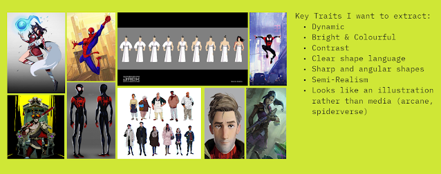
This week I showed the progress I had made with my project. Firstly, I created a miro board to organise my ideas and visuals. Set my art direction, storyline, characters, gameplay, etc. For my character art direction I want a very dynamic and sharp art style, highly expressive and colourful. I want it to feel like an illustration more than a piece of media (such as Arcane and Spiderverse). The characters themselves are fantasy based, having magical abilities and cultural aspects incorporated into them.

The environment design is similar in fantasy nature. Infused with elemental magic. Magic is present in every country, it's just the level of magic that determines a country's power. Meaning areas without less magic are less powerful.

As I am moving two characters from my Game Art module into this project. I tried drawing Minjun (the character shown below) in a more sharp and cell-shaded style. Just as a test to see how it might look.

Lastly, I did some silhouettes for my Maldivian male character, currently dubbed "Nyx" as he is based off my old character design from Semester 3 with the same name.

FEEDBACK
The preparation is fine, but for the world make sure it is secure in the power balance aspect. Create proper disparity and motives for different people to be upset. The art style change is good and fits the current game idea better. The silhouettes require a lot of work. Firstly, anatomically fix the feet and hands. When creating a character design that is "triangle" it doesn't mean every single detail must be triangular. The shapes building the character can have variety, but the general read should be "triangle".
SILHOUETTES


FEEDBACK
The silhouettes are good, we chose a few ones for each character to continue refining. Add values on the silhouettes and detail slightly. Do multiple variations based on the chosen silhouettes, exploring different ideas.
Character Colour Ideating
Here is the colour explorations I did for the characters. The first one being Reyy. I did many outfit variations as in terms of colour I cannot really experiment with it to stay true to the traditional outfit. It is very recognisable in the Maldives due to the fact it is always the same between all men. So changing colours will be disrespectful and also ruin the sense of immersion Maldivians may get. Also we do wear a wear shirt and white bandana at times. But it isn't unusual to not have that either, depends on the person. We ended up choosing number 5 and adding some small adjustments.

The next character is Noor, she was heavily inspired by Maldivian pottery. Called "liyelaa jehun" , it is a very beautiful art in the Maldives, I used the vase as inspiration for her clothing and even her silhouette. Giving her a very strong hourglass figure with a long skirt draping all the way to the floor. A lot of her designs emphasise on her arm having these white tattoos that are inspired by the designs on our pottery. We ended up choosing design 2.

Amrita is the next character. For her I tried experimenting with more colours and outfit choices. But trying to ensure she wears pants, as during silhouetting the skirt was almost an instant no for her character. Not that it looks bad but rather it was not fitting for her character, story, and a gameplay. We ended up going with number 5, but just changing the hair to a braid instead of short because my friend told me that long hair is important in their culture.

Zul was the last character I worked on. He is Malaysian and based around the Malaysian culture. He is an animal trainer, so I tried making his clothing and other motifs based around the Malaysian tiger. He carries a large parang, rather than the iconic keris. Avoided the keris for cliche reasons!

Zul was the last character I worked on. He is Malaysian and based around the Malaysian culture. He is an animal trainer, so I tried making his clothing and other motifs based around the Malaysian tiger. He carries a large parang, rather than the iconic keris. Avoided the keris for cliche reasons!

FEEDBACK
We chose the most appropriate coloured in version for each character. The first character, Reyy we chose number 5. I actually really emphasised how I wanted to go for number 5 as I felt it looked really cool overall. I was told to just simplify him because there were too many unnecessary details. For the second character, Noor, we went with number 2. I was told to add some level of separation down the middle. The third character, Amrita. We went with number 5 as well, just small changes being made to her hair but otherwise remaining the same. For the foruth character, Zul. We chose a mix of number 2 and 5.
POSING
After finalising the the character looks, I had to choose the posing for each character. This part is extremely important as it's basically the part where you infuse life into the character through their actions.
For Reyy, I went for a very aggressive pose. Something like he's running straight at you. He is an assassin with minimal self control when given a target, so I wanted it to reflect in my posing.

Noor on the other hand is very graceful and elegant. She is posh and proper, very put together. She is a powerful mage and a strong character. I wanted her pose to show beauty and elegance, while really display her tattooed arms.

Amrita is a strong woman as well, but for her I wanted to incorporate her traditional dance maneuvers into the posing. I used many bhangra dance poses as reference when drawing hers. I like the one where she's on one leg the most as it really felt like she was in motion.

These were the final poses I worked on, after some refining and defining of clarity in terms of their faces, clothes, accessories, etc. I also had to rework Minjuns pose from last year, as there were many anatomical errors with his one that needed fixing. Keikos was relatively fine, just the face was a tiny bit squished and that was all.

Figure: Noor

Figure: Amrita

Figure: Reyy

Figure: Zul

Figure: Minjun

Figure: Keiko
FEEDBACK
Noor: Looks fine, can continue. Amrita: The legs look terrible, make sure you fix the anatomy and they are correct. Also make sure she is balanced as she is standing on one leg, it can look very awkward if she's not fully balanced.Reyy: Looks good posing wise, just fix the anatomy issues as usual. Zul: The pose is a bit boring, but it's fine otherwise.Minjun: Looks much better than previously, the boot fixes were a good change.Keiko: Good already, just fix the face and arms a bit and that's all.
Illustration: Splash Art
After sketching the poses, I moved onto illustrating them. I used Hades as a major reference when doing this. I kept most objects on the characters strictly to around 4-6 colours only and using cel shading only. I very rarely used the soft brush when shading. I also added in heavily black linework on all the characters as I took a lot of inspiration from Hades and their very high contrast style. Here are all six of the characters fully illustrated:

Figure: Amrita

Figure: Keiko

Figure: Minjun

Figure: Noor

Figure: Zul

Figure: Reyy
FEEDBACK
The illustrations all look good. No major changes to be made, just small refinements on the highlights and shadows if I have the time. Otherwise no need to do anything.
Illustration: Key Art
Lastly, I had to illustrate my key art. I was working on this while also working the splash art simultaneously. Firstly, I created some quick thumbnail sketches of my ideas. Each one involving the characters trying to hide away/being caught. The title being "FRAMED!" I really wanted to emphasise that sort of name. The first one is just directly whne they were caught in the act, the artifact being gone and all their logos being on the wall behind them. The second one is about them hiding away from being found. With a guard holding a flashlight looking for them. Lastly, the third one is about them all still hiding away, but from a more interesting angle overall. For this reason I ended up going with number three.
FEEDBACK
Number two and three are both good. But number three is definitely the most interesting on in terms of composition. I can immediately start illustrating them now.

Figure: Key Art Sketches
After choosing the sketch, I created some perspective grids on my canvas and drew out the rough architecture of the place they were hiding in. After which I drew in the characters. I tried drawing each one of the characters in a clear position so they all can be seen. Minjun is the leader of the group, so I put him front and centre of course. He is the calm in the chaos so I needed him to look the part.

Figure: Key Art Sketch
After the sketch, I did some lineart using the Hades style. Keeping it sharp and adding harsh black shadows. I also added more story to the composition. Keikos fox dragon companion, Mochi is made of fire. Since they're all in a dark place, he is illuminating them with Keiko looking very very worried as they're all having their cover blown.

Figure: Key Art Sketch
After the line art, I just did the base colours + shading. I used the same technique as when I did the splash art. Keeping the colours relatively limited to an area, and harsh cel shading only. With very minimal usage of soft brushes for lighting effects only.

Figure: Key Art Final
FEEDBACK
Good job, it looks well done. Congratulations on managing to pull it off, you did well. (This was feedback from the exhibition day itself
Exhibition Day
For my showcase booth, I created multiple different collaterals. First being A5 prints of each character with a corresponding background that was later reused in the book.
 Figure: A5 Character Prints
I also created small photocards of each character, with a front and back. The front being their splash art, and the back is their signatures. Each one of their signatures having different meanings based around their characters all explained further in the book as well.

Figure: Character Photocards
My last form of output was creating a book explaining about this project. It showcases the story and characters. Going in depth for each character showcasing their process, splash art, abilities, and weapon designs. Along with their photocards. This book also is designed around the premise that each character designed the pages. Having individually unique pages for all six characters.
Figure: Art Book

Figure: Booth Set Up
REFLECTION
This was beyond a ride for me, juggling this while being in charge of our final year exhibition was the most stressful period of my life. Yet, I would never trade this experience for anything. I learned so much throughout these 15 weeks that I feel almost completely new. I learned so much about time management, organisation, leadership, and so much more.
I am also very happy with my major project outcome. After looking at my final output, I definitely know I have so much to improve on. But that's truly what I love about doing art. Being able to constantly improve yourself and do something better when you do it again. Understanding what you're doing, and feeling like you've learned is always such an amazing feeling to me.
I'd genuinely just like to thank my lecturers especially Mr Kannan and Ms Anis, for guiding me so much throughout this entire degree. Without all of the lecturers, I would have never gotten further than where I started. Through criticism and hardwork, I have improved since my first semester here. More than I ever thought I would and I am more than excited to go into the future to further improve myself and continue doing what I love. This degree was more than just a degree for me, it really shaped who I am and solidify that I did choose right.
Thanks to anyone who has read my blog until now! I have heard a lot from younger students about how they'd use me as a reference and it makes me very happy. I wish anyone who reads this all the best and thanks for keeping up with my blog until now!
- <3 Fazal


Comments
Post a Comment